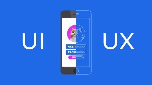
UI and UX design: how they differ from each other, what tasks they perform and how to evaluate their effectiveness
- 14 June 2022 - 14:00. Updated
The design of mobile applications and corporate websites is very important. After all, it depends on how your potential customers will perceive the resource, how convenient it will be for them to work with the program at all. Note that design is not only about beauty and decoration (this component certainly exists), but also about the usability of the application. That is, your client should be comfortable and comfortable using your software product.
There are two important components in the design of mobile applications: UX and UI. These terms are usually used together as UI/UX. But this does not mean that UX and UI have the same meaning. According to Purrweb development studio specialists, the difference between UI and UX is significant. In this article, we will take a detailed look at what UI/UX design is, what it is needed for, what tasks it solves, how to evaluate its effectiveness, and also tell you how UI and UX differ from each other.
UI and UX: what is it, what are the differences between them
UX is the user experience, that is, the history of the user's interaction with the mobile application. UX design allows you to make the design of the application so that any user can immediately open your program, understand what's what and solve their problem.
The development of any mobile application begins first of all with a detailed study of its UX component. To do this, the designer studies competitors' applications, the features and pains of the target audience, its needs, etc. This allows the designer to understand how best to solve the users' problem. For example, how to make an application so that a user can book a hotel room in a couple of clicks, or put goods in a basket in one click. Based on the results of the marketing analysis, the designer develops a prototype.
The prototype is essentially a working drawing of a mobile application. It has buttons, elements, etc. The prototype shows which window opens when a particular button is pressed, and where this button is located.
That is, the result of the UX designer's work becomes a prototype. The latter is then translated into program code. This is handled by the developer.
What is UI
UI is the user interface. If UX is about how to improve the user's interaction with the application, then UI is about how this application looks in the eyes of the user.
At the stage of user interface development, the designer decides what color a particular button, shape, or any other element should be. The specialist primarily proceeds from the convenience of the client - the user should be comfortable and comfortable looking at the application.
At the stage of UI development, the designer can also solve tasks such as branding, logo rendering, etc.
UX and UI: briefly about the main differences
UX and UI have the same goal: it should be convenient and comfortable for the end user to deal with the application.
The differences between them are as follows:
- UX is about the interaction of the application by the user, and UI is about the perception of the application by the user;
- UX affects the user's interaction with information (for example, a specialist decides how a particular button should be signed), and UI - only the visual component (color, size, shape of elements);
- The UX designer works out the logic of user interaction with the application. And UI - considers only external attractiveness.
Trends in UX/UI
Entrepreneurs have long realized the importance of UX/UI for business development. Therefore, UI/UX development has become one of the main stages of mobile application development. Over time, this industry has its own trends:
- simplification of the visual part. Now you don't need to draw buttons from scratch. The user already subconsciously understands that "this colored rectangle" is a button, and you can click on it. The same is the case with the three horizontal stripes - everyone already knows without explanation that clicking this sign will open the menu;
- complication of the design. Although the interface has been greatly simplified, the logic of user interaction with the application has become more complicated. This is explained by the fact that modern applications have a very large functionality - you can leave a request, book a date and time, place an order, etc.;
- the emergence of "narrow" specialists. Now there are UI/UX designers on the market who are engaged in designing interfaces. There were no such specialists before.
UI/UX Design Evaluation Metrics
To improve a product, you need to be able to assess its current state. The design has its own specific metrics that allow you to evaluate the UI/UX. All these metrics can be divided into two groups: behavioral and relational. Let's look at them in more detail.
Behavioral metrics
This includes metrics that are determined based on the analysis of user interaction with the application:
- the total number of pages that the user viewed;
- the amount of money earned over the entire time using the mobile app;
- the length of time it took the user to complete a specific task
- tasks (fill out a form, leave contact details, place an order, etc.). The faster he coped, the better the interface is executed;
- the number of tasks that the user has completed;
- the number of times users leave a task unfulfilled. For example, they do not complete the purchase. Too many failures are a clear signal that something is wrong with the interface.
Relational metrics
This includes metrics that can be collected through surveys or votes. Let's look at some of them:
- SUS. Users are asked 10 questions about the experience of using the application. They answer each question with a score from one to five;
- CSAT. This is the satisfaction index. Users are asked to give a rating from 1 to 5. Ratings 1, 2 and 3 are given by customers who are dissatisfied with the experience of interacting with the interface. But grades 4 and 5 are positive. To determine the satisfaction index, you need to divide the number of satisfied users by the total number of users surveyed. Multiply the result by 100%;
- emotional rating. The main task of this metric is not to get ratings, but to identify the emotions that users experience when using your application. To do this, users are asked to express their reaction by posing emojis.
How are these metrics collected
In professional development studios, specialists use the following methods:
- feedback button. This is the easiest way. Users are asked to express their reaction (usually by choosing emoticons expressing different emotions) and justify their choice;
- surveys. This is the most effective way to collect metrics. Its essence lies in the direct questions that are asked to users.
The most common mistakes in UI/UX design
There are no specific generally accepted rules in the field of interface design. However, it is still possible to identify a number of errors that are very common in the development of application interfaces. Let's look at them in more detail.
The principle of "Click and find out"
The essence of this error is that the developer does not visually highlight buttons and links on the page. As a result, the user simply does not know what and where to click. Another variation of this error is that the button is not signed with text. As a result, the user will have to click on it to find out where this button leads. This is a bad interface. Everything on the page should be clear and understandable - when looking at the button, the user should understand what will happen when clicked. For example, if we see the "send payment" button, we know what will happen when we click on it.
Too many animated elements
Animation is generally a useful thing. But if there is too much of it, then it distracts the user from performing the target action. Animation also makes the product heavier.
Inconvenient menu
This error most often lies in the fact that the menu items are in different places. As a result, the user will have to perform several clicks to solve their problem. This is a bad user experience. Ideally, all menu items should be collected in one place and properly signed.
Interface design should be ordered by professional development studios, for example, Purrweb. Specialists will not just develop the interface of the future application, they will analyze in detail the specifics of your business, study the features and needs of your target audience. Based on the results obtained, Purrweb designers will develop an interface that will meet the needs of your users.
- Comments from the site

- Minecraft 1.14.0.9
- Vkontakte 5.46
- Lucky Patcher 8.5.7
- VK mp3 mod 93/655
- Terraria 1.3.0.7.4
- VK Coffee 7.91
- GTA San Andreas 2.00
- Kate Mobile 53.3
- Pokemon GO 0.157.1
- Freedom 1.8.4
- Google Play Store 17.9.17
- VK App 4.0
- Sims 5.47.1
- Shadow Fight 2 2.0.4
- Last Day on Earth: Survival 1.14.4
- My Telling Angela 4.4.2.451
- Subway Surfers 1.113
- Dream League Soccer 6.13
- Geometry Dash 2.10
- Hungry Shark Evolution 7.0


